5-Card Friday
A Bi-Weekly Update from the ITS UX Team
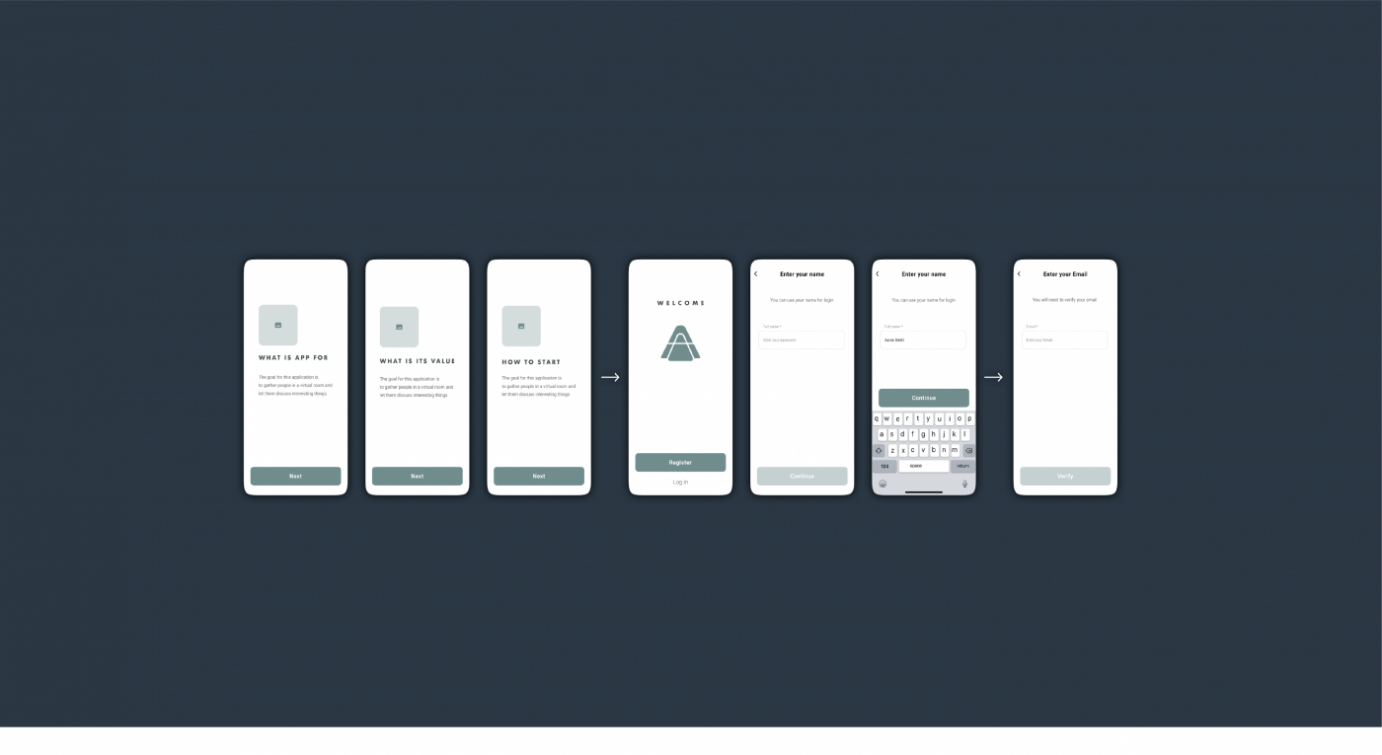
A Simple Method to Analyze Task Flow
As designers, we often have to prove to ourselves and the stakeholders that the task flow we just created is worthy of implementation. It's difficult to find convincing arguments to make them believe that the upgraded flow will be successful (RIP Great ideas).
What is one of the best ways to show the efficiency of a product or functionality? Numbers! To be more specific — ideas validated with data.
Flip the card over to learn more.
A Simple Method to Analyze Task Flow
The most important thing to keep in mind when designing a mobile app is to make sure it is both useful and intuitive. If the app is not useful, it has no real value for user and no one has any reason to use it. If app is useful but requires a lot of time and effort, people won’t bother learning how to use it.
Read Full Article
8 UX writing lessons taught by Winnie the Pooh and friends
UX writing isn’t simply for the newest and greatest start-ups, companies who invest in design teams, or sexy fintech companies. It’s for everyone. That’s because UX writing and content design are flavors of communication that speak to users in every area, on every corner of the internet.
Flip the card over to learn more.
8 UX writing lessons taught by Winnie the Pooh and friends
This is a much debated topic and while designers, developers mostly agree on when it is a good idea to use a navigational drawer and when not there are still a lot of mobile apps that rely on this pattern. It usually boils down to the fact that there is no place to put navigation on a small screen, because it lacks a well thought out information architecture or just because of the sheer amount of content.
Always design with real content, otherwise you’ll end up with placeholders, lorem ipsums and hamburger menus inside hamburger menus. Content on its own doesn’t make sense, and layouts without content either.
Read Full Article

Staying Human in the Age of Big Tech
Are we really using design and technology for the right reasons? Just because we have the capability to create something, does it mean that we should? As technology companies continue to pursue maximum efficiency and maximum profit, there’s something to be said for subtlety. More isn’t always better.
Flip the card over to learn more.
Staying Human in the Age of Big Tech
User experience design is a new industry; having come to life in the early 1990s as personal computers started to become commonplace. UX pioneers like Don Norman (co-founder of Nielsen Norman Group), sought to define how people physically interacted with digital interfaces – as websites and applications were becoming closely aligned with the heartbeat of modern society. Yet as the industry has evolved over the past 25 years, and technology companies have taken even larger roles in our lives, it’s important that we evaluate their continued development with a critical eye and start to define what overreach is, and isn’t. We need to make sure we’re cognizant of the impact of our design decisions, and it’s critical that we approach our work with a human-first mindset.
Read Full Article
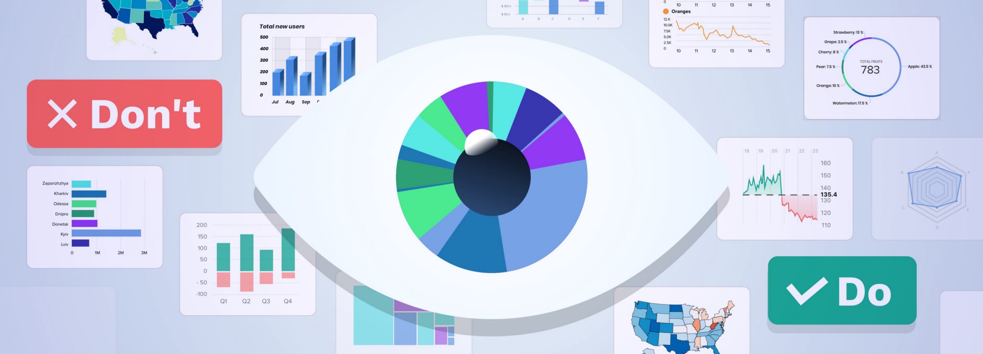
20 ideas for better data visualization
Choosing the wrong chart type, or defaulting to the most common type of data visualization could confuse users or lead to data misinterpretation. The same data set can be represented in many ways, depending on what users would like to see. Always start with a review of your data set and user interview.
Flip the caxrd over to learn more.
20 ideas for better data visualization
Applications we design are becoming increasingly data-driven. The need for quality data visualization is high as ever. Confusing and misleading graphics are all around us, but we can change this by following these simple rules.
Read Full Article
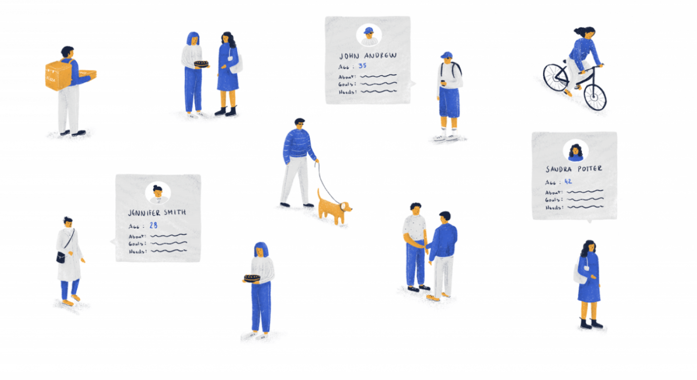
UX Personas are useless. Unless created properly.
Any sort of persona documentation, in our experience, is more often than not utterly useless. That’s not to say that the activity itself is useless. Absolutely not. However, the majority of UX personas we’ve seen are of no help whatsoever. Why is that? Mostly because people tend to write down stuff that is irrelevant to product management or UX design.
Flip the card over to learn more.
UX Personas are useless. Unless created properly.
As mentioned earlier, UX personas should be updated regularly. The first draft will be messy. That’s the point of iterative approaches. You build new findings on top of the old ones. However, more often than not, we see people create superfluous personas just once and think they’re done. We’ve seen people include hobbies, siblings, education details, and other information that’s quite frankly useless.
Read Full Article