5-Card Friday
A Bi-Weekly Update from the ITS UX Team
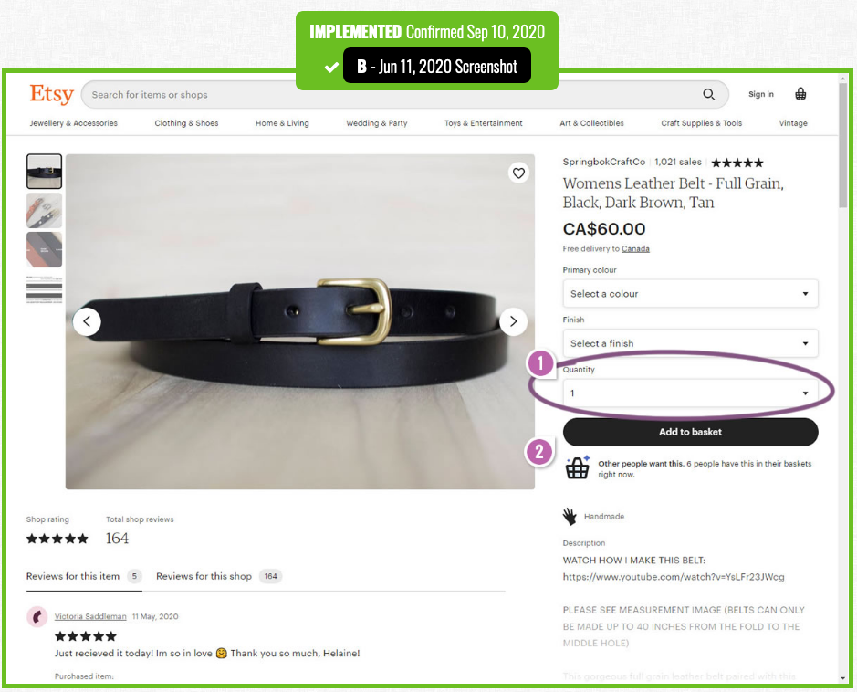
Etsy's Product Quantity Options Receive A Confirmation From This A/B Test
Etsy was noticed A/B testing a product quantity pulldown menu on some of their products.
Find out more about this experiment on the back of this card.
Etsy's Product Quantity Options A/B Test
In this experiment, Customers were basically given the option to purchase more than one item. GoodUI explored a very similar experiment which was successfully ran by Bol. And in this new experiment, a similar outcome can be seen with the quantity options now being visible on most products (possibly driven by rules based on segments, availability and settings).
Read Full Article
Accordion Icons: Which Signifiers Work Best?
For good reasons, accordions are a popular UI element today: on mobile, they are an essential tool because they collapse content and make page length manageable, but even on desktop, they mitigate visual complexity and allow users to focus on the content most relevant for the task at hand (and are particularly appropriate in complex applications).
A question many UX designers ask is: Which icon should we use to best signal that content will expand in place? In other words, what’s the best signifier for accordions?
Flip the card over to learn more from this NN/g article.
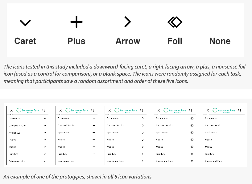
Accordion Icons
NN/g investigated the question about which accordion icons to use as part of a bigger study of navigation and subnavigation on mobile. They looked at several possible icons as signifiers for accordions:
- Caret (or downward-facing arrow)
- Plus
- Right-facing arrow
- No icon at all
Which icon to use in the IUX Pattern Library's accordion component was something that we debated as well. We decided to go with the plus/minus icons as the signifiers for our Pattern Library's accordion component. Here, we use SVGs for both icons, and toggle their display with CSS based on data attibutes.
Read Full Article
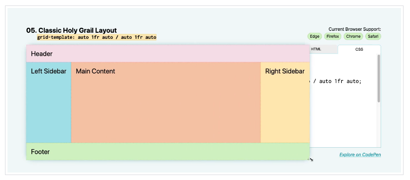
Ten Modern Layouts in One Line of CSS
This article highlights a few powerful lines of CSS that do some serious heavy lifting and help you build robust modern layouts.
Flip the card over to learn more.
CSS for Modern Layouts
Modern CSS layouts enable developers to write really meaningful and robust styling rules with just a few keystrokes.
This article contains demos which examine 10 powerful lines of CSS that pull off some pretty complex layouts, including CSS Grid code to center items vertically and horizontally, Flexbox layouts for stacking columns on mobile devices (e.g., the "deconstructed pancake"), and many other example layouts with sidebars, headers, and footers.
Read Full Article
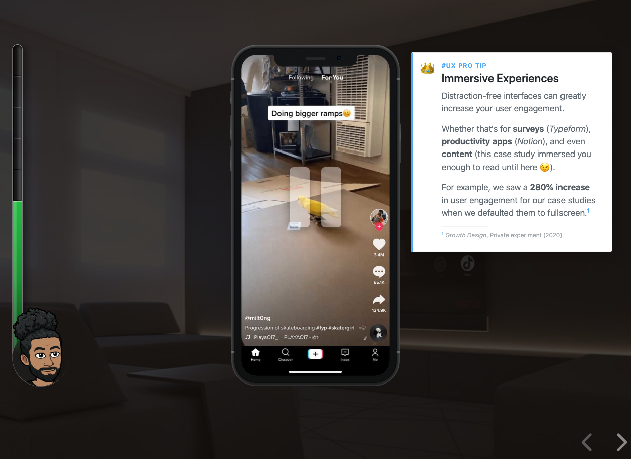
The Psychology Behind TikTok's Addictive Feed
TikTok is notoriously addictive. In this UX case study, Growth.Design analyzed the psychology behind its video feed.
Concepts such as immersive experiences, habits, personalization, and sticky content and more are explored.
Learn more about this insightful case study on the back of this card.
TikTok's Addictive Feed
Several psychological principles are covered in this 4-minute long UX case study on TikTok's feed.
Immersive Experiences - Distraction-free interfaces can greatly increase your user engagement.
Habits = Dominos - The nudge might seem trivial. It's not. It the most important
IP Sniffing for Personalization - TikTok detects and uses your IP address to personalize content based on what people around you enjoy. But, does this feel intrusive to users?
Sticky Content - Popular videos on TikTok all have same things in common—they are short, unexpected, concrete, emotional, and tell a story. These are 5 key elements which make an idea stick.
Observer–Expectancy Effect - You behave differently when you know you're being observed.
Variable Rewards & Habits - TikTok's videos are more addictive than other social platforms for 3 reasons—they are short, snapped, and surprising.
Providing Exit Points - Allow users to disengage from your product with a sense of completion.
View/download this 2-page PDF which lists 101 psychological principles that affect your UX.
View the Case Study
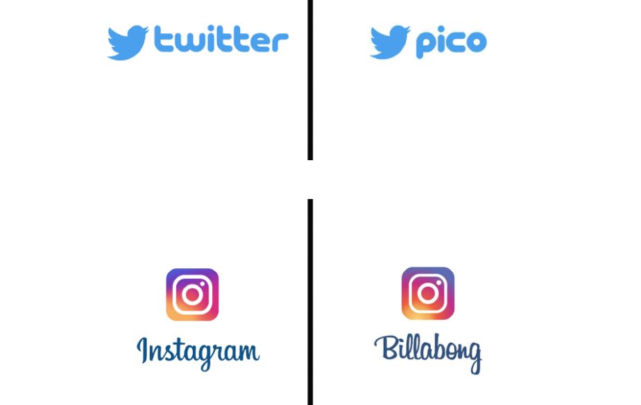
These are the fonts behind 30 famous logos
For the last couple of years, designer Emanuele Abrate has been demystifying famous logos by reverse-engineering what fonts they used or evolved from.
While many famous brands use a proprietary typeface for their logos, Abrate points out that the designers will normally use an existing font as a jumping-off point, and his project, Logofonts, allows viewers to look under the hood of famous logos by revealing their likely typographical origins.
Flip the card over to learn more.
Fonts Behind Famous Logos
The inspiration for Abrate’s project comes from his interest in combining the strange and the familiar. "When these two characteristics come together," he says, "there is the possibility of creating something really interesting. ... For this reason, I decided to analyze the logos of famous brands, replacing the company name with the name of the font that was used."
Seeing these deeply familiar brand images deconstructed in this way is oddly satisfying, especially when the font is one that we’re used to in other contexts.
You can see more of Abrate’s work on his website, and follow his ongoing Logofonts project on Instagram.
Read Full Article