5-Card Friday
A Bi-Weekly Update from the ITS UX Team
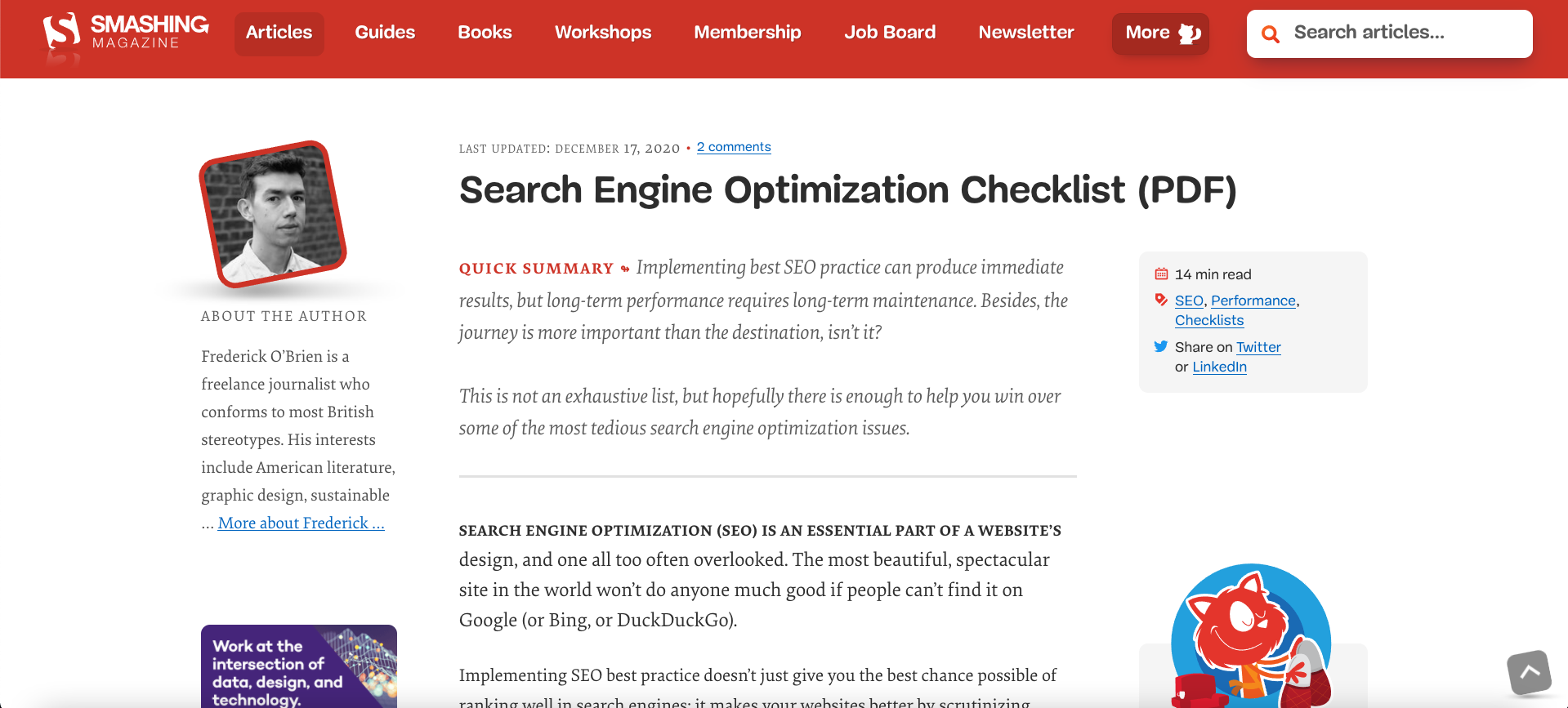
Search Engine Optimization Checklist
Search engine optimization (SEO) is an essential part of a website’s design, and one all too often overlooked. The most beautiful, spectacular site in the world won’t do anyone much good if people can’t find it on Google (or Bing, or DuckDuckGo).
Flip the card over to learn more.
Search Engine Optimization Checklist
Implementing SEO best practice doesn’t just give you the best chance possible of ranking well in search engines; it makes your websites better by scrutinizing quality, design, accessibility, and speed, among other things. It’s a daunting world for those who aren’t familiar with it (and even those who are at times), so this checklist breaks down key factors to consider when undertaking an audit.
Read Full Article

Top 10 User Frustrations on Web
Avoid these top 10 user frustrations if you can.
Learn more on the back of this card.
Top 10 User Frustrations on Web
Smashing Magazine put together a list of the top user frustrations of 2020. Here are the top 10:
- Small-sized text
- Tiny click targets
- Unexpected content shifts
- Data loss on errors
- Not working “Back” button
- Scroll hijacking
- Sign up walls
- Autoplay video with sound
- Permission to send in-browser push notifications
- Permission to store cookies
Read the full article to find out how to tackle these issues.
Read Full Article
Daily Ethical Design
What is ethical design? And how can we start to practice it to create a better society?
Flip the card over to learn more.
Daily Ethical Design
"Design ethics concerns moral behavior and responsible choices in the practice of design. It guides how designers work with clients, colleagues, and the end users of products, how they conduct the design process, how they determine the features of products, and how they assess the ethical significance or moral worth of the products that result from the activity of designing."
-Encyclopedia.com
Read the full article to understand how we can start to practice ethical design.
Read Full Article
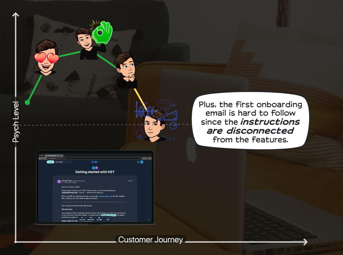
User Onboarding: Is HEY Email Worth It?
The Growth Design case studies are some of the coolest ways to learn about user experience—looking at new companies and sites and dissecting what they are doing right, and wrong, as far as UX.
This case study is for the HEY emails, and covers many UX principles.
Learn more about this exciting case study on the back of this card.
User Onboarding: Is HEY Email Worth It?
I'm betting that everyone reading this card right now has had times when their personal inboxes are just flooded with emails you are not interested in. And, even though the main email providers provide many tools for managing your emails and spam, it still seems like a daunting task sometimes. So, when a company like HEY comes along and says that they "fixed" email, it definitely grabs attention.
This UX case study examines some of the UX principles used in the HEY onboarding experience. Some of these principles help with the UX, some of them are not implemented well (e.g., missed opportunities).
These UX principles include:
- Embracing the power of differentiation
- Knowing your customer's mind inside and out
- Staging out forms and getting users engaged
- The "endowment effect": People value something more if they feel it's theirs
- Personalization
- Deferred account creation and reciprocity: People feel the need to give back when they already received value
- Transparency with the onboarding process (not "lying" to your users)
- Contextual onboarding: Making sure you show the right message at the right time
- Prioritizing your "Aha!" moment
View Case Study
Visual Hierarchy in UX: Definition
Have you ever encountered a webpage that was so busy with various design elements that you had no idea where to even begin to look? If you struggle to find focus on a screen, it’s likely that the layout is missing a clear visual hierarchy.
The page’s visual hierarchy controls the delivery of information from the system to the end user — it lets users know where to focus their attention.
Flip the card over to learn more from this NN/g article.
Visual Hierarchy in UX: Definition
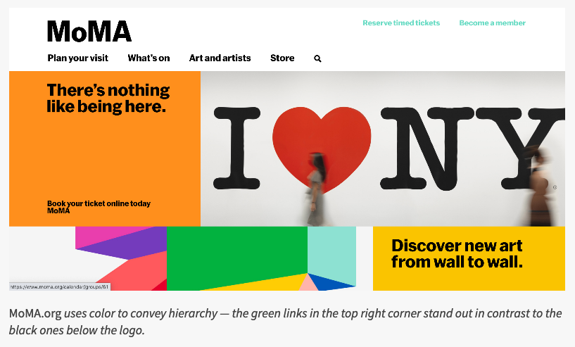
A clear visual hierarchy guides the eye to the most important elements on the page. It can be created through variations in color and contrast, scale, and grouping.
Definition: The visual hierarchy of a 2D display (webpage, graphic, print, etc.) refers to the organization of the design elements on the page so that the eye is guided to consume each design element in the order of intended importance.
Visual hierarchy can be created using:
- Color and contrast
- Scale
- Grouping (proximity and common regions)
Learn more about this important UX principle along with screenshots of sites using this principle in the full article.
Read Full Article