5-Card Friday
A Bi-Weekly Update from the ITS UX Team
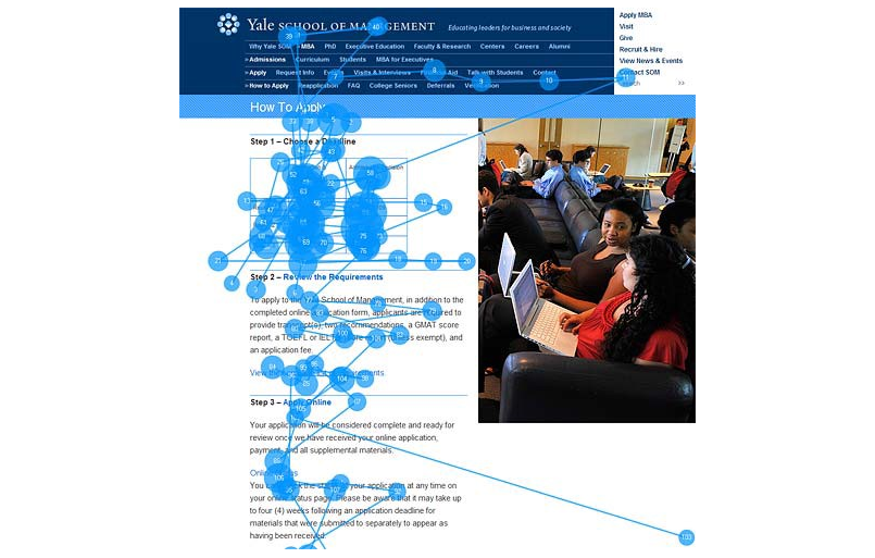
Think about content holistically, choose images wisely
An image is worth a thousand words, but a bad image is worth more than a thousand bad words.
Find out more about the importance of picking the right images for a website on the back of this card.
Choose Images Wisely
Some of the takeaways from this article include:
- Unless your project is small and with a restrictive budget, or for a very small company or client, don't be cheap.
- When you see the same generic images across sites, apps, banners, blogs, emails or any digital media, you know subconsciously that something is "off."
- "Invest in good photo shoots: a great photographer can add a fortune to your website’s business value." — Jakob Nielsen
Learn more about the importance of choosing the right images for a site in the full article.
Read Full Article
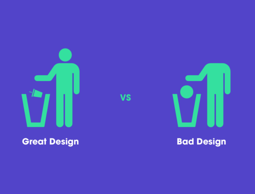
10 Small Design Mistakes We Still Make
"The human brain's capacity doesn’t change from one year to the next, so the insights from studying human behaviour have a very long shelf life. What was difficult for user twenty years ago continues to be difficult today." — Jakob Nielsen
Flip the card over to learn about these design mistakes we still make.
Design Mistakes
This article explores these 10 design mistakes in detail:
- We don't read, we scan
- Create effective visual hierarchies
- Don't reinvent the wheel
- Product instructions must die
- We do not care how your product works
- People don't look for "subtle cues"—we are in a hurry
- Focus groups are not usability tests
- We allow personal feelings take over the process
- You ask the wrong questions
- When a person uses your product, you forget that she shouldn’t spend time thinking about…
Read Full Article
Awesome Design Diagrams
In this article, the author revisits the discourse about design in the research field and explores an archeological collection of diagrams which define "Design."
Learn more on the back of this card.
Awesome Design Diagrams
In the 21st Century, the word “Design” is everywhere, such as Service Design, Business Design, Organization Design, Policy Design, and Lifestyle Design. It went beyond traditional product and communication realms and now is the key to innovations and societal transitions toward more sustainable, equitable, and desirable long-term futures. Under these circumstances, my motivation is simply to design the word "design."
View the collection of diagrams which define "design" in the full article.
Read Full Article
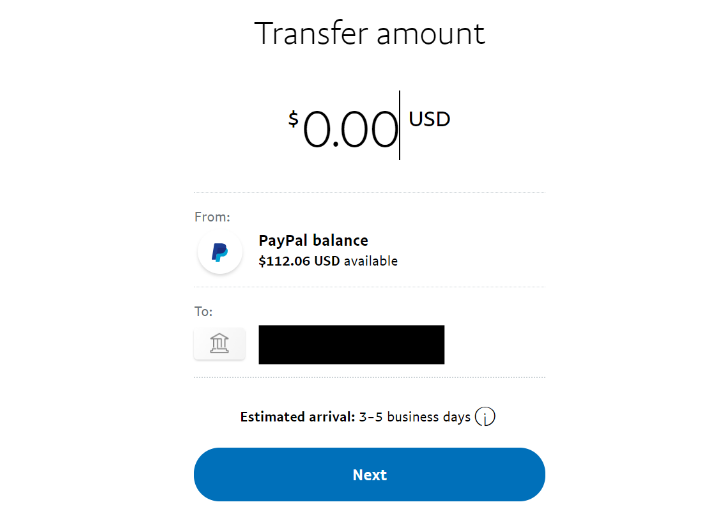
Even tech giants make UX mistakes—and this one could cost PayPal some users
It doesn't matter if you are a bleeding edge startup working on your first MVP or a seasoned tech giant like PayPal, UX mistakes happen, but would you really expect them from a tech giant like PayPal?
Flip the card over to learn more.
PayPal's Money Input Field UX
Have you ever been confused when inputting in the dollar amount on PayPal to send or withdraw money? If so, you're not alone.
What throws many users off is that the blinking cursor in the amount field is at the end of the field, not the beginning. This design is a deviation of the norm, and can users to have trouble not only understanding how to input the amount, but also when using the backspace and delete buttons.
According to the author, "One of the biggest things that is missing here is a simple and user friendly way to clear the entire input and reset everything back to $0.00."
Do you think PayPal used this design to favor mobile users? Or to miminize input errors? Or, to speed up input? Read the article to find out more about this UX case study.
Read Full Article
The Myths of Color Contrast Accessibility
There's a growing demand for designers to make their interfaces accessible to all users. It’s important to accommodate users with disabilities, but there are many myths to color contrast accessibility being perpetuated by misinformed people.
Flip the card over to learn more.
The Myths of Color Contrast Accessibility
This article debunks common color contrast accessibility myths and sets the record straight. The myths explored in this article include:
- Myth 1: The WCAG requirements are always optimal
- Myth 2: Text must meet the AAA requirement, or it’s inaccessible
- Myth 3: Interface components have the same contrast ratio standard as text
- Myth 4: Gray text and buttons are inaccessible and look disabled
- Myth 5: Color-blind users can’t tell the difference between contrasting colors
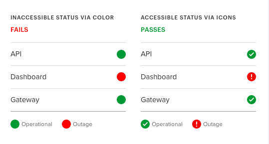
- Myth 6: Using a color cue alone isn’t sufficient in conveying information
- Myth 7: An accessible design meets the needs of every user on the planet
Read the full article to learn more about color contrast and why it's important.
Read Full Article