5-Card Friday
A Bi-Weekly Update from the ITS UX Team

Sprint by Google Ventures [Speed Summary]
Everybody is doing "design sprints" these days—the accelerated design-thinking approach to innovation and problem-solving.
And now Google has just revealed its blueprint for running design sprints in a book penned by Jack Knapp and colleagues—"Sprint: How to solve big problems and test new ideas in just five days."
Flip the card over to learn more.
Sprint by Google Ventures [Speed Summary]
Design thinking is the "test-and-learn" approach to innovation based on the idea that innovation is the source of insight, rather than insight as the source of innovation.
Traditionally, corporate innovation—which has a 90%+ failure rate—starts with the market research or insights department setting out to learn about a market and its opportunities. This learning is then used to kick off and guide the innovation process—often involving ideation workshops and concept development—culminating in a testing phase.
Read Full Article
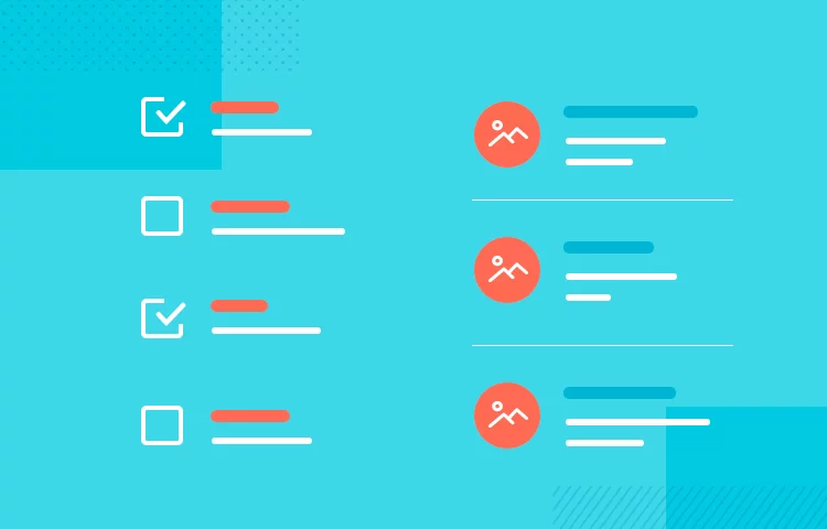
Guide to List UI Design: Principles and Examples
How important are lists in UI design? How much do they affect usability and what’s the best way to design them? Find out in this guide on list UI design!
Learn more on the back of this card.
Guide to List UI Design: Principles and Examples
From the Tablets of Stone engraved with the Ten Commandments, to the Rosetta Stone’s three versions of the Decree of Memphis, lists have always been around. And from stone to modern UIs, it’s safe to say that this technique of summarizing information has come a long way!
Why do we create lists? Because they’re a natural way to optimize scannability and summarize content. Lists are a way to remember, to summarize and a way to get things done. And in UI design, it’s no different.
Read Full Article
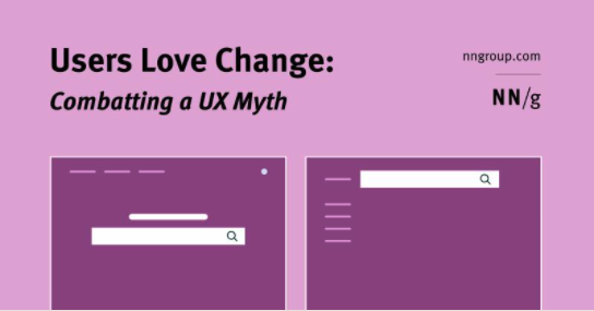
Users Love Change: Combatting a UX Myth
One myth in the world of user experience is that users hate change. The basis of this argument is that users don’t like to learn new things.
For existing users of your product, changing the interface causes them to relearn how to use it, which takes time and effort. This argument assumes that users’ time and effort are wasted and fails to acknowledge an inherent human need: to learn and adapt.
Flip the card over to learn more.
Users Love Change: Combatting a UX Myth
Frequent major redesigns and changes throughout the interface support user’s need to learn and adapt to new situations.
The reality is users love change and it is our responsibility as designers to provide them with experiences that allow them to learn and adapt. The best way to fulfill these needs is by regularly releasing major product redesigns.
In this article, the author discusses the benefits of frequent major redesigns, how often you should redesign, and what areas to change.
Read Full Article
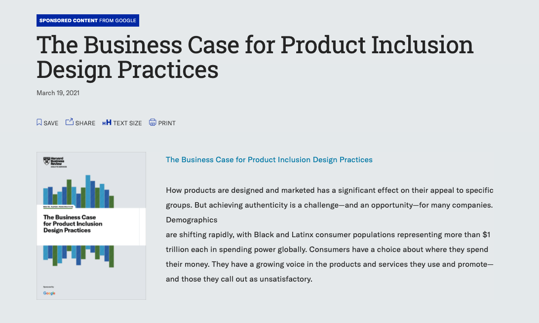
The Business Case for Product Inclusion Design Practices
How products are designed and marketed has a significant effect on their appeal to specific groups. But achieving authenticity is a challenge—and an opportunity—for many companies.
Flip the card over to learn more.
The Business Case for Product Inclusion Design Practices
Demographics are shifting rapidly, with Black and Latinx consumer populations representing more than $1 trillion each in spending power globally. Consumers have a choice about where they spend their money. They have a growing voice in the products and services they use and promote—and those they call out as unsatisfactory.
Read Full Report
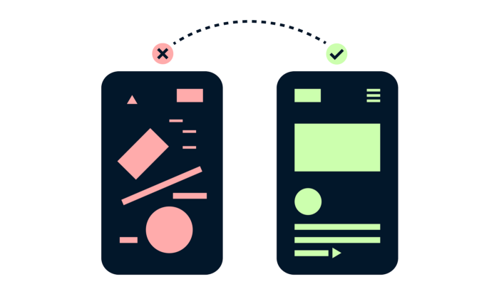
13 Tips For Improving Landing Page Design
A landing page is a great way to drive traffic, improve your SEO and build your brand. Landing pages lead customers to a specific product, service or offer and encourage them to take action.
This is your opportunity to create conversions and build your customer base.
View the 13 tips for improving landing page design and learn more on the back of this card.
13 Tips For Improving Landing Page Design
A landing page is a standalone web page that a person "lands" on after clicking through from an email, ad, or other digital location.
A great landing page should have a clear visual hierarchy and value proposition, and should be tested for the best conversion optimization.
- Use a color overlay on images with text.
- Don't over do negative space.
- No lones likes a word salad.
- Even text only layouts should be visually appealing.
- Icons small, illustrations big.
- Use letter spacing sparingly.
- Watch your line lengths in FAQs.
- Show me the value.
- No ones likes tiny text.
- Apply the rule of odds.
- Manage cognitive overload.
- Use bright colors as an accent.
- Always check the contrast of gray text.
Read Full Article