5-Card Friday
A Bi-Weekly Update from the ITS UX Team
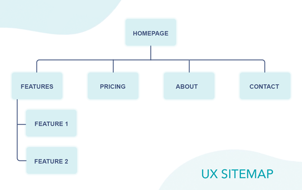
Can a Website Sitemap Create Better UX? UX Sitemap Guidelines
A UX (User Experience) sitemap is a diagram of the various pages included in your website or app. Its primary purpose is to visualize the relationship between the given pages (URLs) or site elements.
Flip the card over to learn more.
Can a Website Sitemap Create Better UX? UX Sitemap Guidelines
The UX sitemap plays a vital role in developing websites. It helps you improve website navigation and prevents you from missing out on the critical parts of your website’s architecture, delivering a better user experience. It also allows web owners to understand how users use and navigate their websites. For UX designers, a UX sitemap is an important planning tool needed mainly in the early stages of the UX design process.
Read Full Article

5 Best Practices for Designing Effective Buttons
Buttons are important elements in creating a smooth conversation.
Flip the card over to learn more.
5 Best Practices for Designing Effective Buttons
In terms of designing a button, a few basic practices have proven to be effective so far. The main point is all about knowing what catches attention and inspires users’ to take action.
Read Full Article
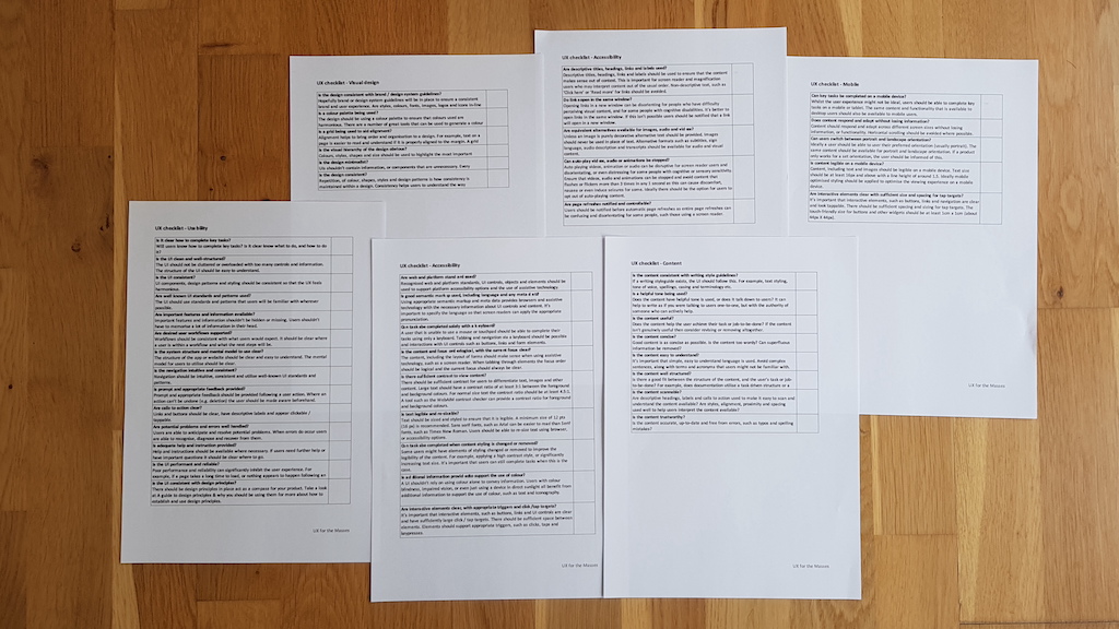
How to maintain quality with a UX checklist
A UX checklist such as the example in this article helps a team to maintain a desired level of quality.
Flip the card over to learn more.
How to maintain quality with a UX checklist
A UX checklist list shouldn’t only be checked just before a release. Not only does this leave insufficient time to address any concerns, but it’s not helping to bake the sweet taste of quality throughout the development and design process. A UX checklist should be used to help review early designs, to review work whilst it’s in development and of course to help answer that all important question: Is the team happy to go ahead with a release?
Read Full Article
Accessible Designs Make Better Products: Workday’s Story
First off, accessibility is tackled at the design stage. This statement is not meant to deter or depreciate any effort that takes place in other sects of product development. Rather, it means if we think about accessibility from the start, we allow ourselves the opportunity to reduce development time, safeguard our company from legal trouble, and create something fundamentally more usable.
Flip the card over to learn more.
Accessible Designs Make Better Products: Workday’s Story
- Everyone’s capabilities are unique; therefore, everyone’s experience interacting with the world is unique. Consider each lens when creating something that might be interpreted in different ways, depending on a person’s physical and psychological capabilities.
- Starting with an accessibility-minded approach to design, engineering, and product will ultimately save you time, money, and headaches.
- Testing accessibility-based decisions for yourself is a great step. But getting your products into the hands of people with varied accessibility needs is the best way to measure if something works.
Read Full Article

6 Ways to Design Value into Your Membership Model
There is no one formula for designing a compelling membership offering. But membership should be more than a basic loyalty program. It must offer either exceptional rational value or deep emotional value.
Flip the card over to learn more.
6 Ways to Design Value into Your Membership Model
Rational value implies tangible benefits: customers know exactly what they’re getting from the offering, and it’s easy and straightforward to justify and explain their continued loyalty. Emotional value is intangible but at least equally powerful. While it may not be quantifiable, it creates a genuine connection that generates sustained engagement and loyalty.
There are various levers—value drivers to design a membership offering around—that ladder up to and provide rational or emotional value. Cost, convenience, and incentives and rewards provide rational value; identity, community, and experience provide emotional value.
Read Full Article