5-Card Friday
A Bi-Weekly Update from the ITS UX Team
The Definitive Guide to the Difference Between Filters and Facets
You could be forgiven for assuming filters and facets for search are the same thing. Both exist to serve the same purpose: narrowing down search results by eliminating results or pages that don’t match selected criteria. But, there are noteworthy differences between facets and filters.
Learn more on the back of this card.
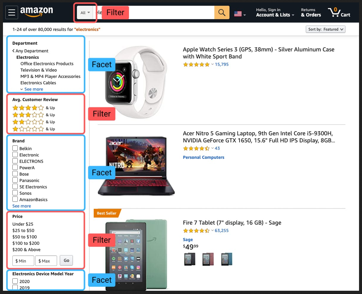
Filters vs. Facets
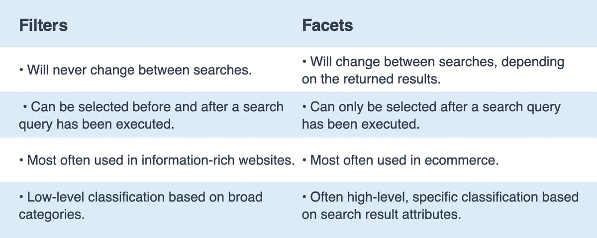
Filters are broad categories that are selected by the user to immediately eliminate pages or results on a site. They can be chosen before a search query has been entered, or immediately when presented with search results.
Facets are a bit more specific—they are filters but pertain exclusively to the results from a search. As they relate specifically to your query, you'll never find facets that are irrelevant or inconsistent with what is displayed. You'll see that different facets are displayed depending on what your query is, and what the returned results are.
Here are the the main differences of filters vs. facets broken down.
Read Full Article

Don’t Use “Click Here”
If there’s so much information out there, why is it still so common to see “click here” links on the web?
Flip the card over to learn more.
Why “Click Here” is So Bad
Using vague and uninformative phrasing for hyperlinks will have several adverse effects on your website:
- Decrease in overall usability
- Decrease in overall accessibility
- Decrease in search engine performance and content findability
Read about these issues with using "click here" as hyperlink text, as well as other common hyperlink mistakes that are commonly used, in the full article.
Read Full Article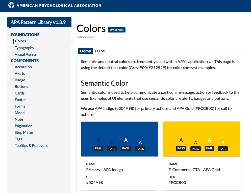
New Colors Section in the IUX Team's Pattern Library
The importance of color design stems from the significance of color to the human mind. Color creates ideas, expresses messages, spark interest, and generates certain emotions. Color can also be used for branding, by tying all of our sites and applications together visually.
Creating a color palette is one of the earliest things we thought about when creating the IUX Team's Pattern Library, since it’s so fundamental to design and development decisions.
Learn about the revamped Colors section in the IUX Team's Pattern Library on the back of this card.
IUX Pattern Library - Colors Section
We've recently revamped the Colors section of the IUX Pattern Library to make it easier for us to use branded colors in our designs, as well as using semantic colors in our application user interfaces, all while keeping color contrast accessibility in mind.
The new sections in the Colors section include semantic color, neutrals, the primary APA branding color palette, the secondary APA branding color palette, and the APA Publishing-specific branded colors. Within each color card, we have either "pass" or "fail" labels for how light and dark text are viewed on each color for small and large text, based on WCAG 2.1 AA color contrast conformance.
Go to the Pattern Library
Local Navigation Is a Valuable Orientation and Wayfinding Aid
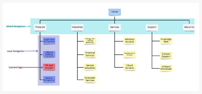
Local navigation indicates to users where they are and what other content is nearby in an information hierarchy.
Local navigation serves a few purposes simultaneously:
- It indicates the category of the current page and, thus, works as an orientation element, similar to a “You are here” indicator on a map.
- It shows links to other pages (or information) within the same information-architecture (IA) category and, thus, serves as a wayfinding element that tells users where they can go from their current location.
- It facilitates access to deep parts of an IA (e.g., second or third-tier subcategories) that would otherwise require a higher interaction cost to access.
Learn more on the back of this card.
Local Navigation
The IA structure of most websites is hierarchical, and a familiar way to visualize that hierarchy is a tree. The global navigation of the site shows the top tier of the tree, no matter where the user currently is in the structure. The global navigation is stable—users can expect that it will remain the same throughout the site and they can use it to jump between major categories. On the other hand, the local navigation shows information about the node the user is currently viewing and also includes the other nodes on the same branch of the tree. Consequently, the local navigation will vary from category to category and will show content offerings that are related (or at least close in the site’s information architecture) to the current page. Local navigation, however, does not vary from user to user or session to session.
Learn more about local navigation and how to determine if you need a location navigation UI on one or all sections of your site in the full article.
Read Full Article
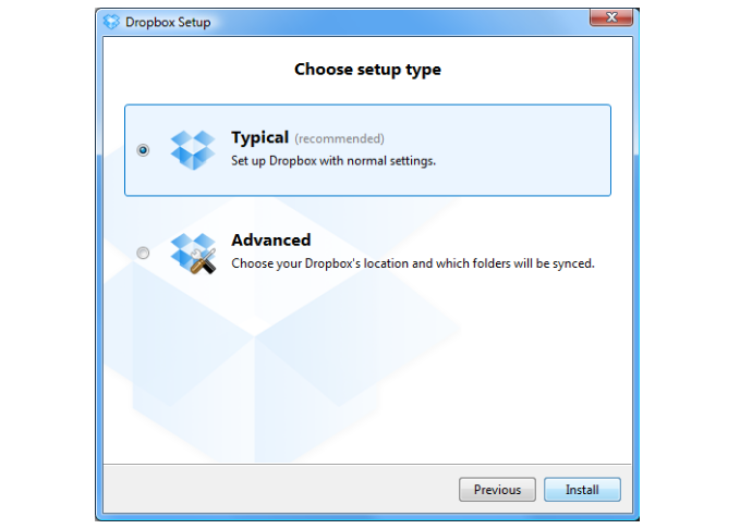
Radio Buttons: Select One by Default or Leave All Unselected?
In traditional application design, the first radio button in the list was always selected by default. But the unbridled world of website design challenged this practice, making it fairly common to have no radio button selected by default.
Today’s websites, forms, and applications inconsistently select one or leave all radio buttons blank by default. If none of the buttons is selected by default, users have no way to revert to this original state after they’ve made a selection. The lack of a standard can be confusing to users.
Flip the card over to learn more.
Radio Buttons & Selecting One by Default
The main guideline for radio button design is to select one of the radio buttons by default (i.e., when the page loads, in the case of a web application.) This is good usability and elegant design.
Reasons for a default radio button selection include:
- Expedite tasks: Making a default selection is helpful if you have conducted task analysis and most users make the same choice.
- Give people control and align with their expectations: It is better to have a selected radio button by default, given that people cannot deselect and set the button back to its original state once one has been selected. A default selection sets the correct user expectation.
- Power of suggestion: Selecting is directive. Some things to watch out for though are being presumptuous, pushy, offensive, or alienating. Consider the content and the default selection, how users will react to it, and the effect the selection will have on the user and the organization in both the short and long term. Unless it’s been thoroughly tested (via observational methods as well as with metrics) and proven successful, avoid presumptuous default selections.
Read Full Article