5-Card Friday
A Bi-Weekly Update from the ITS UX Team

Embedding UX in Product Development
We are looking to work closer with product teams to further refine what the definition of done looks like for apps and sites. To help communicate this effort, we have updated our Confluence space.
Flip the card over to learn more.
Embedding UX in Product Development
These practices will help make our apps more usable, accessibile and competitive. If you have any questions, please contact us at ux-services@apa.org
Go to Documentation
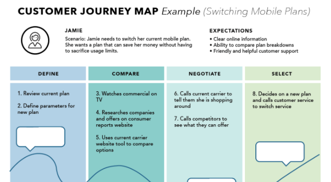
Customer Journey Mapping
Journey maps are a common UX tool. They come in all shapes, sizes, and formats. Depending on the context, they can be used in a variety of ways. This article covers the basics: what a journey map is (and is not), related terminology, common variations, and how we can use journey maps.
Check out our iTalk next Thursday, September 23 to learn more about customer journey maps.
Flip the card over to learn more.
Customer Journey Mapping
A journey map is a visualization of the process that a person goes through in order to accomplish a goal.
In its most basic form, journey mapping starts by compiling a series of user actions into a timeline. Next, the timeline is fleshed out with user thoughts and emotions in order to create a narrative. This narrative is condensed and polished, ultimately leading to a visualization.
Read Full Article
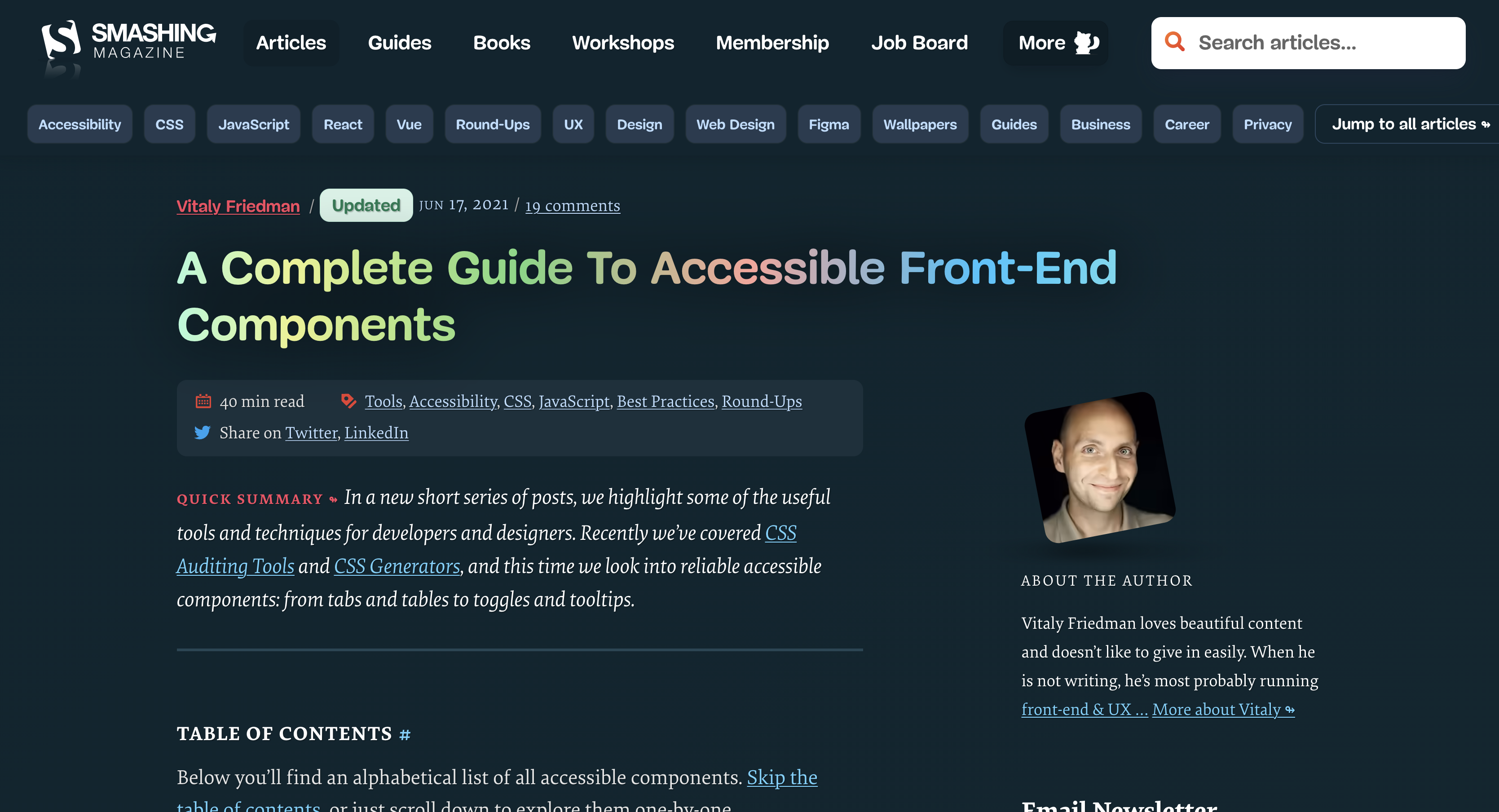
A Complete Guide To Accessible Front-End Components
Accessible front-end development ensures people with different abilities can access, understand, and navigate web content, regardless of how they're accessing it. Front-end developers collaborate with other members of a cross-functional team to implement a robust user experience.
Flip the card over to learn more.
A Complete Guide To Accessible Front-End Components
Smashing Magazine has put together a list of accessible front-end components. Check out this list to see if it can help your next project.
Read Full Article
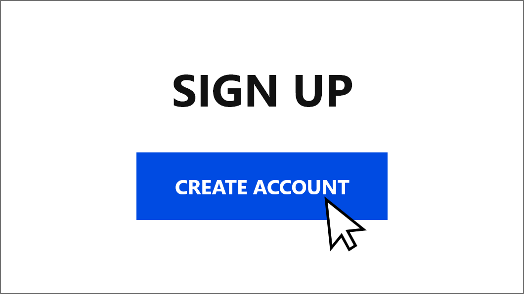
10 Tips For Designing Better Sign-up Forms
Simple ways to improve the sign-up experience.
Flip the card over to learn more.
10 Tips For Designing Better Sign-up Forms
Sign up forms are a necessary evil. We avoid them as much as we can online but at some point we will definitely run into one. Many users actually get to the sign-up page on a website but leave because they have hard time understanding three things:
- What they need to fill in
- Why it is necessary for them to give out that information
- How to submit the form successfully.
Read Full Article
UI Cheat Sheet: Spacing Friendships
Color, typography, imagery, etc., are usually given to you in a brand guide — but correctly using spacing is a skill. After a while it becomes second nature, but only after you have learned and used the basic rules.
Flip the card over to learn more.
UI Cheat Sheet: Spacing Friendships
When you improve your spacing, the following happens:
- It is easier for users to consume the content.
- It creates a hierarchy of information that relays importance to the user.
- It creates consistency throughout your designs.
- It just looks better.
Read Full Article