5-Card Friday
A Bi-Weekly Update from the ITS UX Team
Fonts in Use
Do you need to decide on a typeface for a project but are missing some inspiration? Or maybe you have a sweet spot for all things typography? Either way, the site Fonts In Use, might be just what you’ve been looking for.
Learn more on the back of this card.
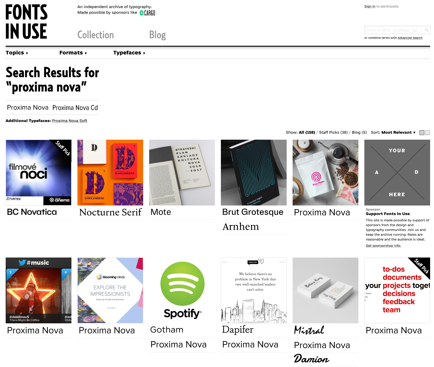
Fonts in Use
Fonts In Use is an archive of typography indexed by typeface, format, industry, and period.
From vintage invoices and newspaper adverts from the beginning of the 20th century to candy packaging and movie title sequences from today, the site is a treasure chest of typographic samples of all origins.
This site is a great way to discover new fonts.
Visit Fonts in Use
New APA2020 Virtual Convention Data Studio Dashboard
APA's first virtual convention was a great success, and reviewing and understanding the data we have about our attendees and their experiences will help us plan for next year's convention as well.
Flip the card over to learn about a Google Data Studio dashboard that has been made for convention-related analytics.
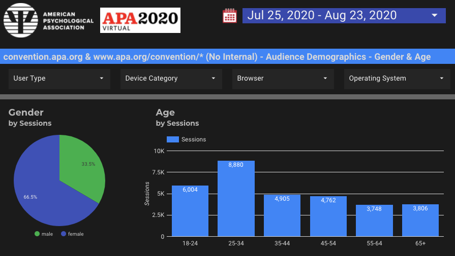
APA2020 Virtual: GA, GSC, and Ads Reports
This new Data Studio dashboard has datasources from Google Analytics for the convention.apa.org site, as well as partial data from the Omnipress vendor.
In addition, Google Search Console data for convention.apa.org data is included, which shows the queries that usres typed into Google search and then the landing pages they landed on from such queries on the convention website.
Finally, there is a report for the Google Ads (Google Grants Pro) "Convention 2020" campaign.
View the Dashboard
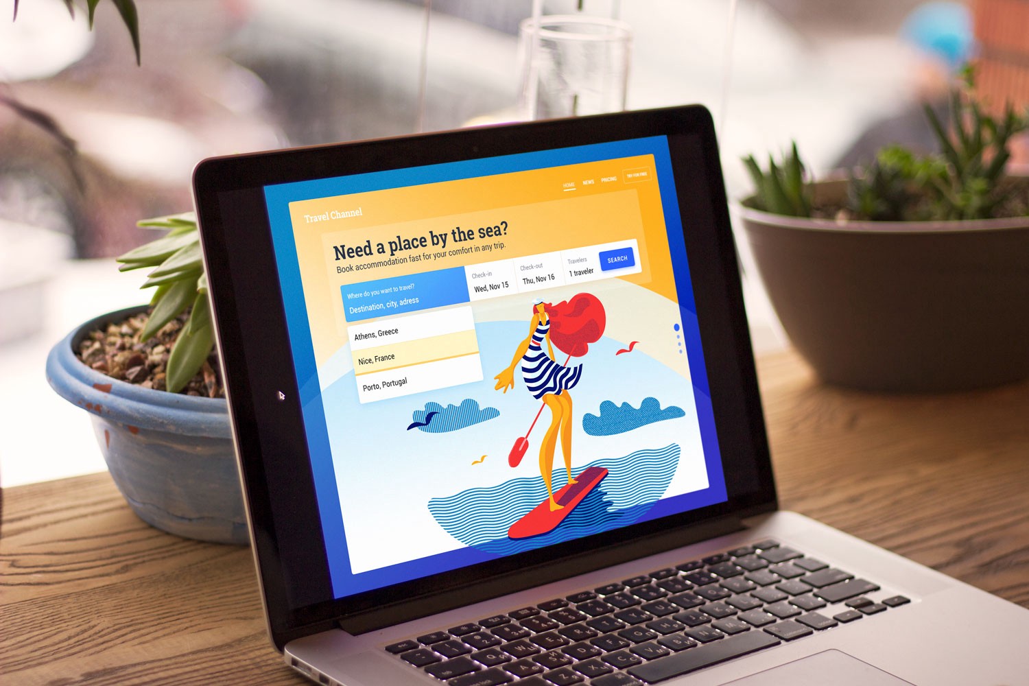
8 Handy Tips on CTA Button Design
User interfaces usually consist of many different elements. Each of them plays a significant role in the efficiency of user experience as well as conversion rates of websites and applications.
Flip the card over to learn more about CTAs.
8 Handy Tips on CTA Button Design
A call-to-action (CTA) button is an interactive UI element both web and mobile. Its major aim is to induce people to take certain actions that present a conversion for a particular page or screen, for example, purchase, contact, subscribe etc.
Lead generation and purchase rise are the basic business goals which calls-to-action can be created for. When a button design is compelling enough to immediately attract the attention of potential clients, it can entice them to click and go to the next stage such as filling a short contact form or making a preorder of a product.
Read Full Article
How an improvement to APA PsycNet helped over 100,000 users
On May 28th, 2020, APA PsycNet launched a new check access flow that helped over 100,000 users (50,000/month) get access to their desired PDFs. This was a cross-collaborative effort among different teams and departments that ended up being extremely useful for users who were logged out of the platform.
Flip the card to learn more about the Janus project and its impact on users.
How an improvement to APA PsycNet helped over 100,000 users
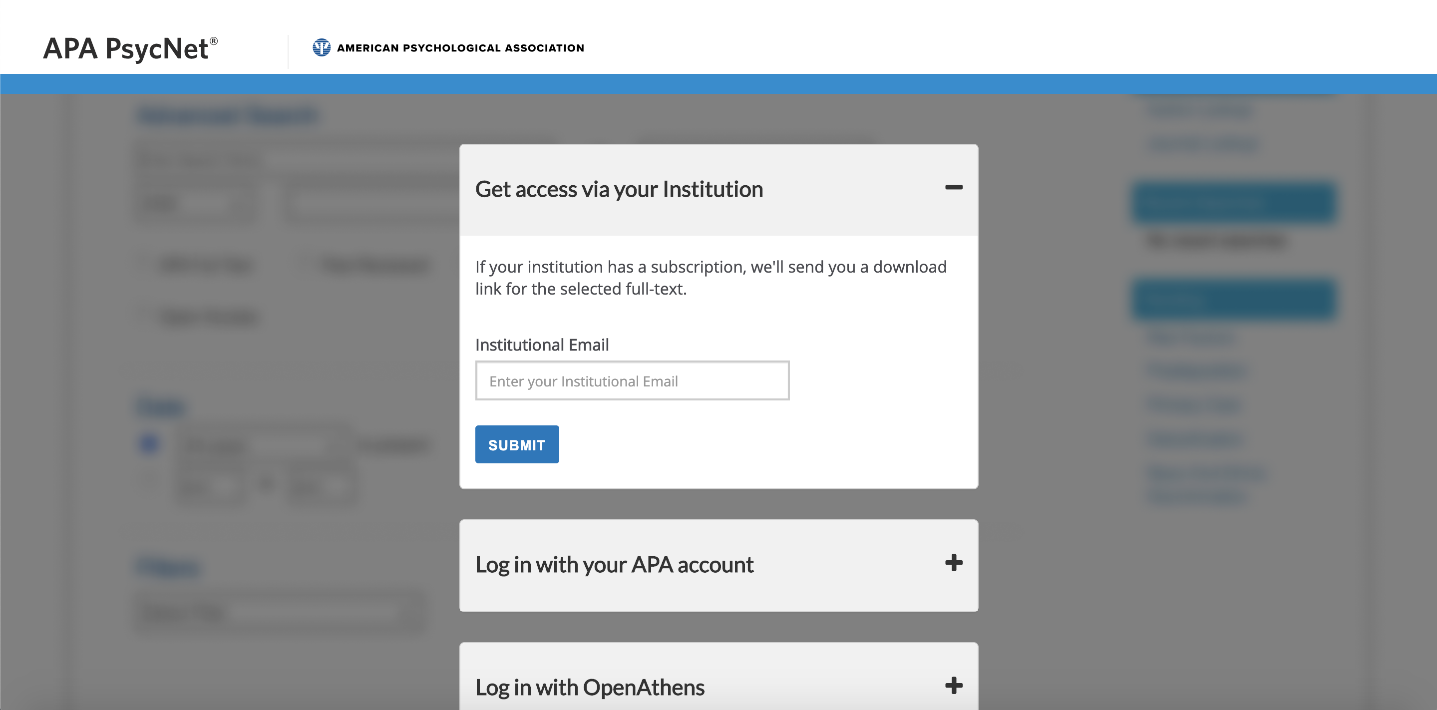
The Problem
Anonymous/Logged out users were unable to access APA PsycNet PDFs. Depending on the user’s subscription type, they might be required to be on campus to access the PDFs, making it difficult if they’re short on time.
The Solution
Allow users to access a PDF by using a one-time download link.
The Approach
If the user is not logged in and clicks the download PDF button on their desired article, they will be prompted to check to see if they have access to APA PsycNet. From there, they see if they have an APA account, institutional subscription, or Open Athens account. Once they verify their account, they will be able to get the one-time PDF download.
Collaboration amongst different groups and departments helped to make this project a success. Here is a list of the groups involved:
- Janus task force (a cross-team group that worked on the concept and specs)
- APA PsycNet
- IDEM
- ITS UX
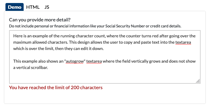
Character Count Added to Pattern Library
We added the new character component to the Forms section of our Pattern Library, as it is used in textarea fields. This character count is modeled after the gov.uk component for accessibility. An example of usage is the Polaris onboarding and preference management forms.
Flip the card over to learn more.
Character Count Added to Pattern Library
The design of the character component we used allows user input to exceed the maximum characters but applies an error class to the character count when the input exceeds the maximum allowed characters. This lets users type or copy and paste their full input, then edit it down. In addition to this message, frontend validation should be used to prevent form submission when the input exceeds the maximum allowed characters.
The character count is also fully accessible by use of aria-describedby and aria-live="polite" attributes. The "aria-describedby" attribute is used to indicate the IDs of the elements that describe the object. And according to the WAI-ARIA spec: The values of the "aria-live" attribute are expressed in degrees of importance. When regions are specified as "polite," assistive technologies will notify users of updates but generally do not interrupt the current task, and updates take low priority.
Go to the Pattern Library