5-Card Friday
A Bi-Weekly Update from the ITS UX Team

Why Your Organization Needs Product Principles
At Slack, every one of our processes and features has been designed with the primary goal of making Slack a workplace tool that feels human. We see ourselves as our users’ hosts, and we want them to feel comfortable and happy every time they’re in Slack.
Flip the card over to learn more.
Why Your Organization Needs Product Principles
Our product isn’t just built for work—it’s built for people doing work, and everything we create is meant to forward our mission of making work life simpler, more pleasant and more productive.
Our job is to understand what people want, and then translate that value through thoughtfully designed, well-functioning products and features.
Read Full Article

3 Design Choices That Make WhatsApp the Best Instant Messenger
People love their messaging apps like their hometown sports teams. You’ll find die hard fans of iMessage, Messenger, Telegram, Signal, etc. defending their platforms with a ferocity found more in sports bars than on internet forums.
Learn more on the back of this card.
3 Design Choices That Make WhatsApp the Best Instant Messenger
When iMessage launched in 2011, many predicted the demise of the popular internet-based chat app, WhatsApp. But years later, even with big entrants like Facebook Messenger, people (including myself) still use WhatsApp more frequently than all my other clients combined.
Read Full Article

What Does It Mean to Be Inclusive in UX Research?
When we think of a futuristic reality for the human race, we think of flying cars and holographic calls. We may not be there just yet but we are sure on our way to building a digital future for all.
Flip the card over to learn more.
What Does It Mean to Be Inclusive in UX Research?
In fact, the next billion users are hailing from developing countries in Asia, Latin America, Africa and more. More people are coming online especially during the pandemic with 40% of them in East Asia subscribing to mobile internet for the first time. The future looks bright indeed with emerging tech focusing on the next billion users.
With that said, we can’t simply continue design in the same ways we primarily designed for the predominantly wealthy and privileged groups adhering only to western views.
Read Full Article
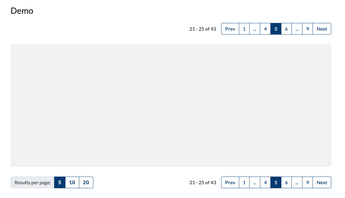
Pagination Component Updated in the IUX Pattern Library
We upgraded our Pagination component in the IUX Pattern Library by improving the styling, improving the accessibility, giving examples and a demo, and providing rules of usage.
Learn more on the back of this card.
The IUX Pattern Library Pagination Component
Do you know when it's best to use a "load more" button, or how about "infinite scrolling"? And, when to not use either of those designs, but instead use pagination?
The IUX Team really dug into the usage of these user interface components, and updated our Pagination component in the IUX Pattern Library with improved styling, accessibility, and rules of usage.
We're currently using the Pagination component on several web applications, and I'm sure we'll be using it again when dealing with search results and large data sets. It seemed like the perfect time to solidify this important component and come up with a design we can use in the future with sticking to our branding and our focus on accessibility and mobile responsiveness.
Learn more about the Pagination component by visiting the IUX Pattern Library.
Go to the Pattern Library
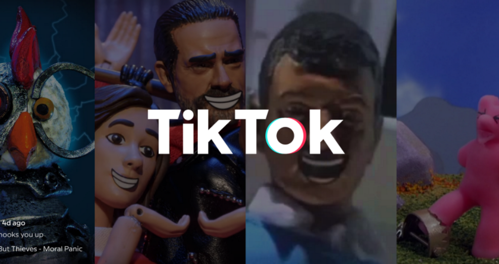
How TikTok Design Hooks You Up
Have you ever used TikTok?
This article examines how TikTok onboards new customers, creates habit loops, drives our behavior, and hooks us up to keep using the app.
Flip the card over to learn more.
TikTok & UX
TikTok's designers know the Hick's law, which states that:
The more choices users have, the harder it is for them to make one. William Edmund Hick and Ray Hyman
In TikTok's design, the users aren't given all of thei roptins at once, but instead are only shown the desired options. This makes it easier for users to choose the options which are relevant to the task at hand.
The registration process is quick and easy. The users have to provide their birthday, phone or email, and then confirm it. One task per step is a common solution because users perceive a complicated task easier to complete if it’s split into smaller ones.
Read more about this UX principle and other ways that TikTok is using psychology to improve its user experience in the full article. And, check out this case study on the psychology behind TikTok's addictive feed we featured in our 10-2-2020 5-Card Friday.
Read Full Article